Designing for accessibility
Some examples:
A business has just lost out on an experienced lawyer, 5 years qualified – who can’t use your website, because no one thought to make it compatible with the screen-reader she needs to use now that she’s losing her sight.
You can’t change the colour of your screen because it’s blocked by IT security. Company IT policy is set at global level and cannot be adapted for anyone locally, regardless of whether you are the janitor or a senior VP.
A £75 software you requested is not on the ‘approved’ procurement list, so the exception request is likely to take 6 months to resolve. In the meantime, you just have to ‘make do’
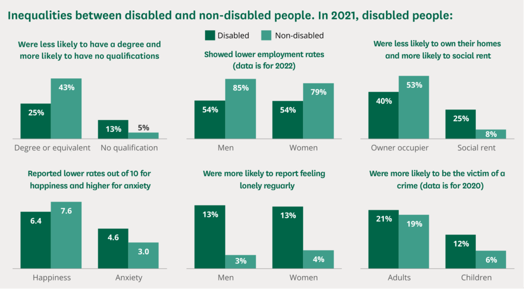
Source: Census 2021 data
How can you help when designing logos and infographics?
Use headings and spacing to group related content
Include image and media alternatives in your design
Provide sufficient contrast between foreground and background
Don’t use colour alone to convey information
Ensure that interactive elements are easy to identify
Provide clear and consistent navigation options
Ensure that form elements include clearly associated labels
Provide easily identifiable feedback
Describing pictures
An illustrated picture of two similar doors, on the left is a door with the word ‘push’ written above. The door features a flat square where the handle should be. On the right is a door under the word ‘Pull’. This door has a handle.

Give it a go!


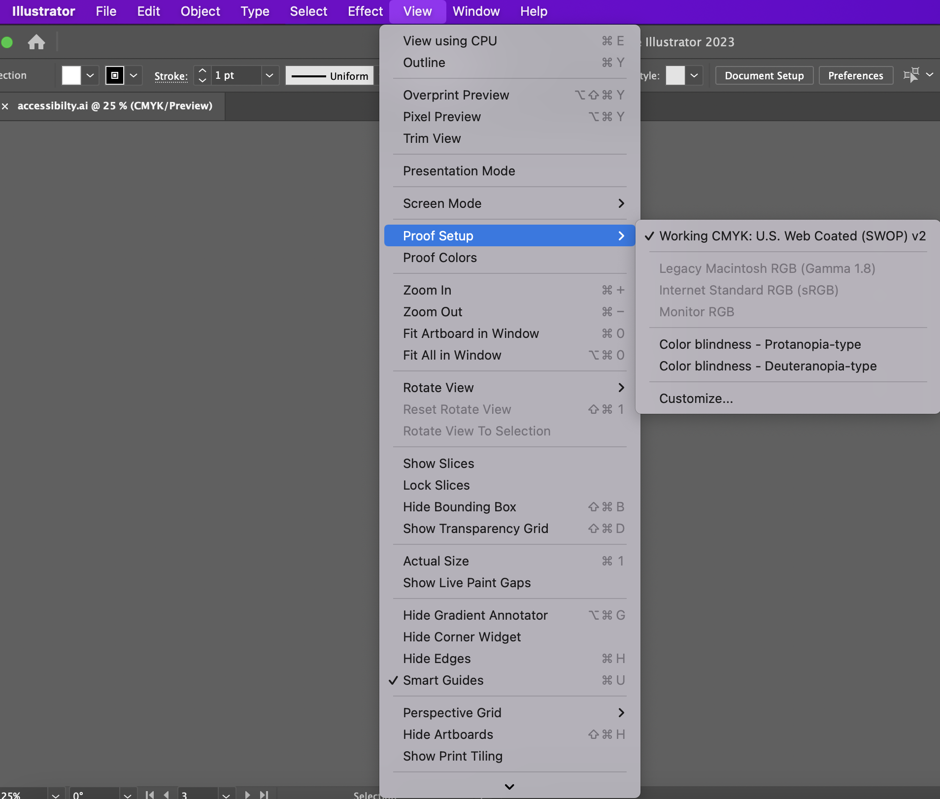
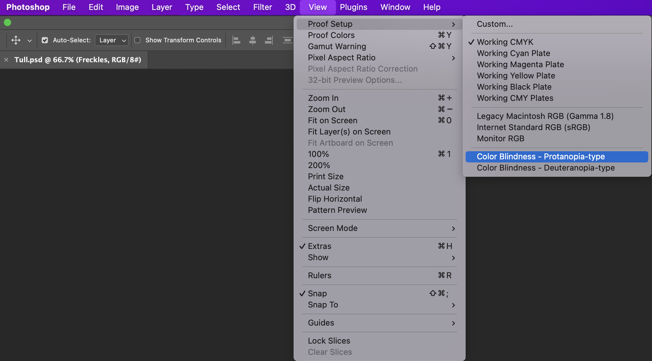
Colour choices
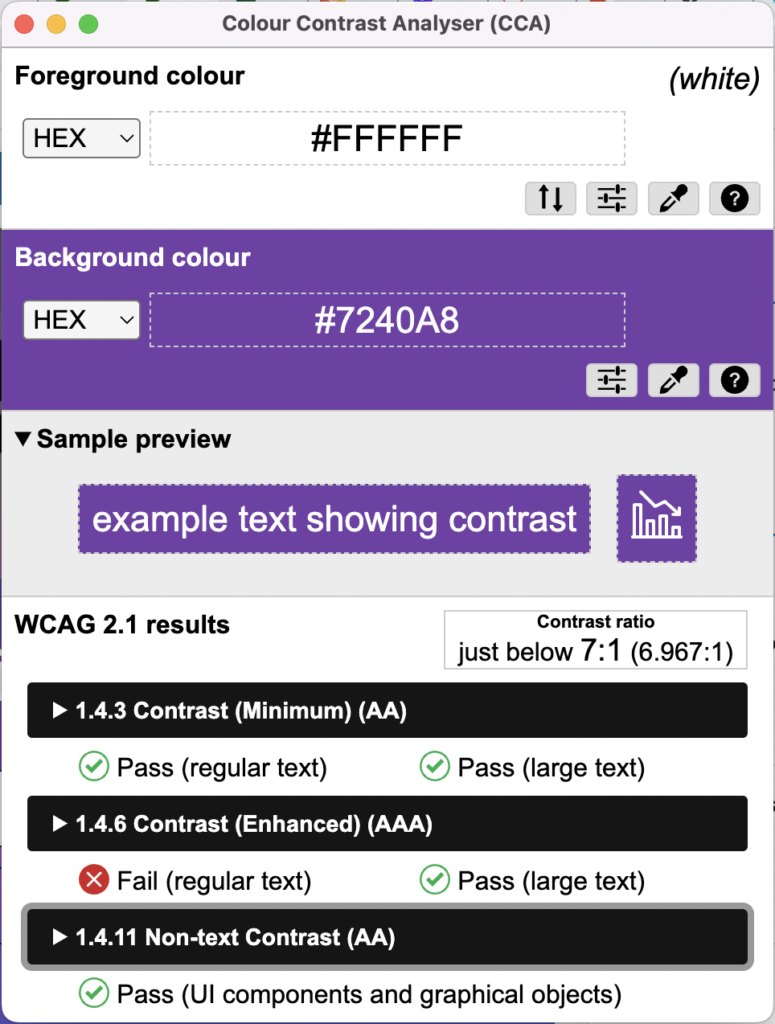
Download Colour contrast analyser to check colour suitability
Ways to instantly improve your brand’s digital accessibility
1. Factor it in from the outset
Digital inclusivity isn’t an extra step, or a box to tick, you should weave the needs and perspectives of people with disabilities into initial plans and objectives.
2. Create a style guide
This controls where somebody might use your content
3. Carry out a content audit
Where is your content accessible? Where could you improve? Think of what you might have missed. Change can start with small details like adding braille code to business cards, or putting some subtitles on an animation or video.
4. Be accessible for your users.
Be reachable, be engaged, welcome feedback. Who better to convey your user experience than your users. By listening to what they have to say, you can make brand improvements that earn their trust and buy-in.
Five brands that take inclusive experiences seriously
The variation in neurological and physical abilities within communities is vast, and becoming widely recognised. New design approaches that deliver a better, more accessible experience for all are driving innovations, such as:
- Microsoft – these tech giants get it right. Their software incorporates an artificial intelligence that detects and to converts heading styles that are more suitable for visually impaired users. A new excel pane is designed to work with screen readers, a high contrast mode can be used when sharing content using PowerPoint live, as well as a dark mode in Word to reduce eye strain.
- Google made finding wheelchair accessible locations as easy as typing in an address. Users can now turn on ‘Accessible Places’ feature which indicates wheelchair friendly places.
- Apple launched a dedicated Applecare support team for people with disabilities and re-designed its accessibility site to make users aware of new capabilities.
- Amazon’s new feature called Show and Tell helps blind and partially sighted people identify common household grocery items.
- Pinterest has recently made efforts improve the universal usability its site, offering different levels of colour contrast to help those with visual impairments, as well as improving navigation and screen-reading support.
Videos
The importance of subtitles and transcripts
(Private link for Coventry students)