Design theory and applying it to improve aesthetics
Contents
https://coventry.domains/dooo/
What size should your image be?
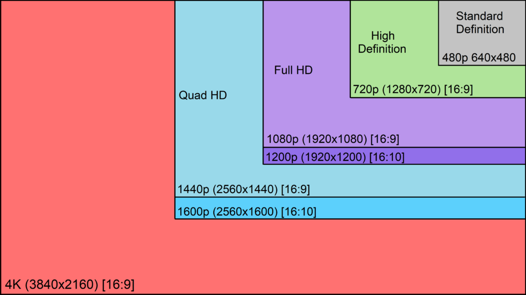
If you are designing for video/screen – work to screen size ratios over paper sizes. For example, HD TV should be 1920×1080 pixels
Screen sizes
Paper sizes
| A0 | 841 x 1189 | 33.11 x 46.81 |
| A1 | 594 x 841 | 23.39 x 33.11 |
| A2 | 420 x 594 | 16.54 x 23.39 |
| A3 | 297 x 420 | 11.69 x 16.54 |
| A4 | 210 x 297 | 8.27 x 11.69 |
Resolution
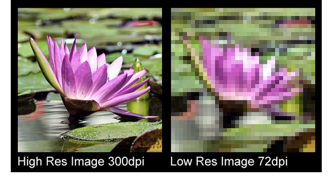
150-300 dpi (300 dpi is best unless machine is struggling).
Colour Theory
Add contrast!
Choosing complimentary colours:
How to ensure a strong design….
Designing with accessibility in mind:
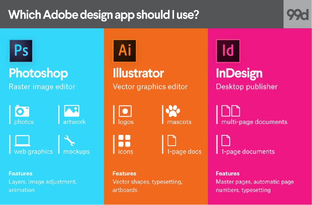
Photoshop or Illustrator?
Photoshop is a raster graphics software while Illustrator is a vector graphics software
Choosing Fonts
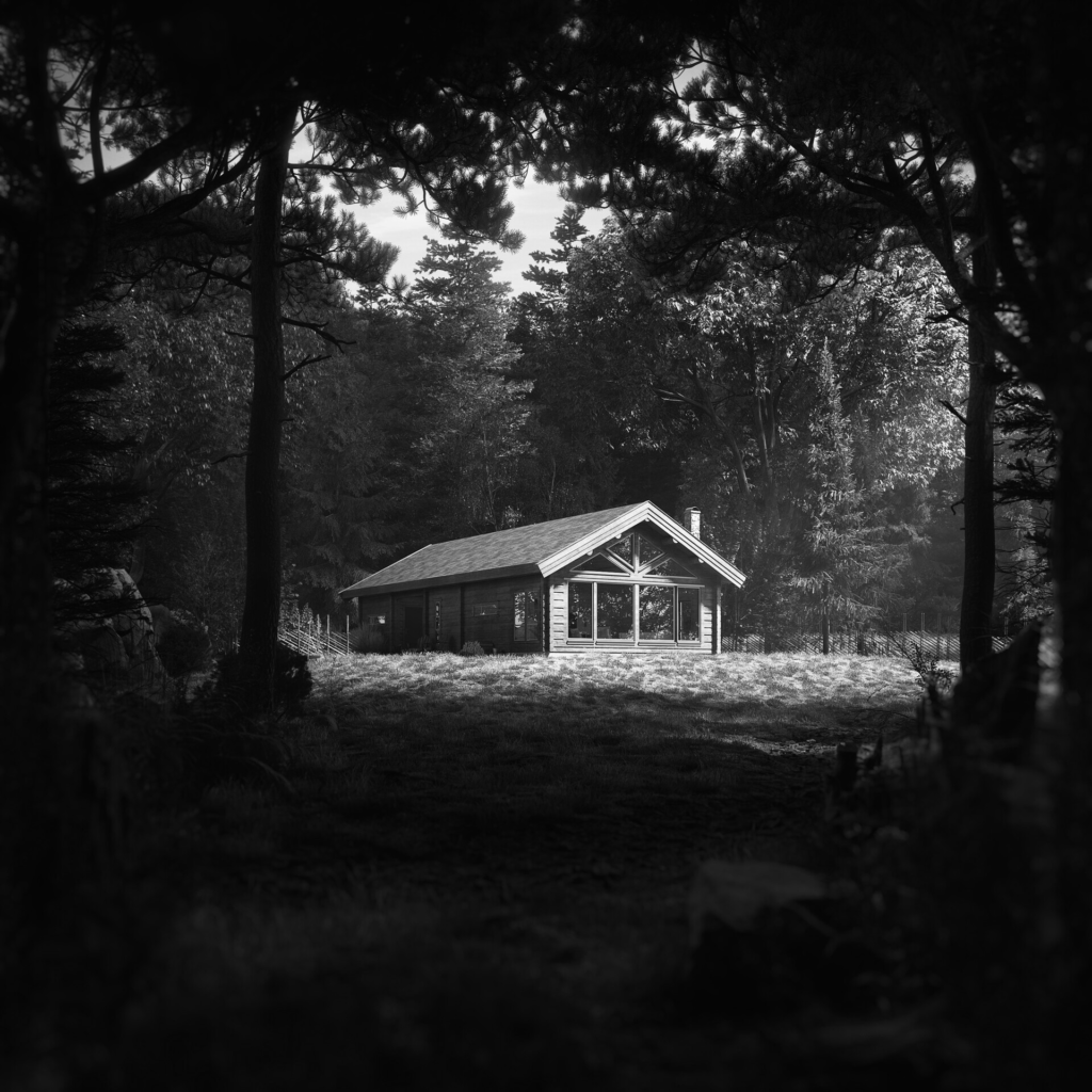
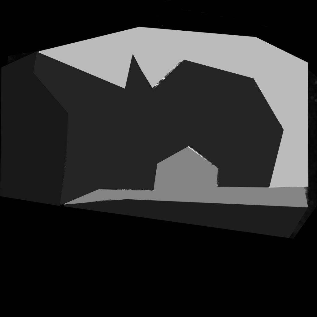
Creating depth in a composition
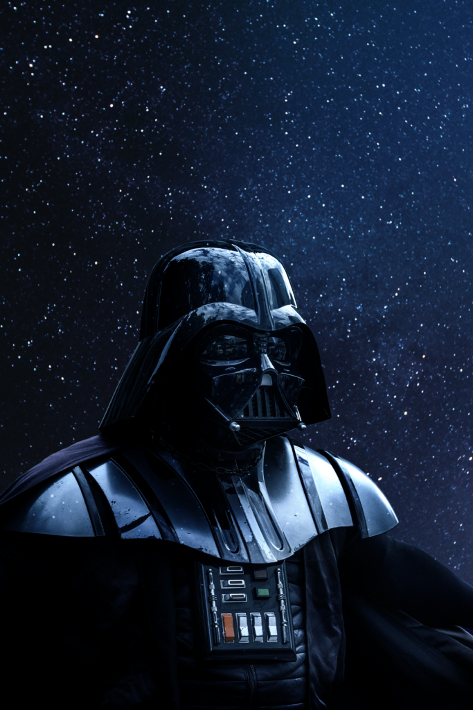
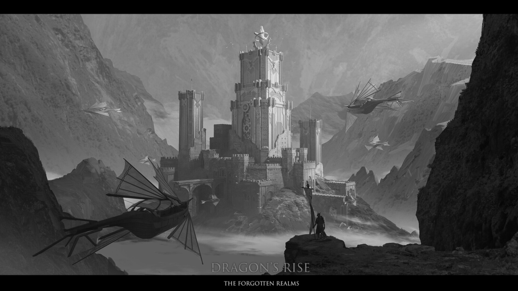
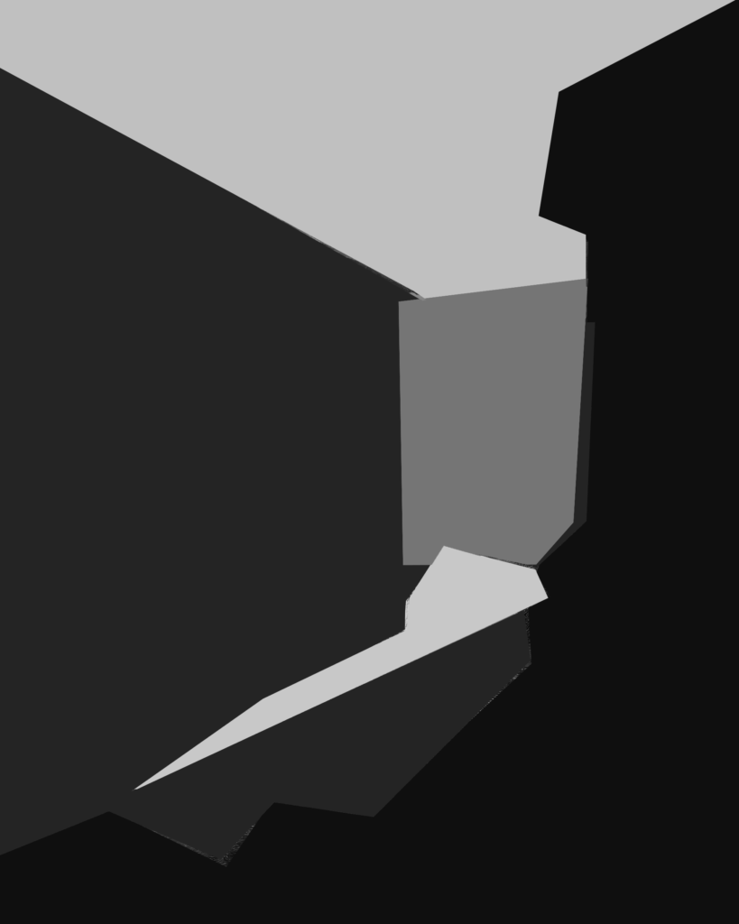
Where you apply light and dark lighting creates an impact. To instantly create depth the closest objects should be the darkest. The next objects back should be darker, followed by the third layer, which if created to be the lightest object in the scene will draw the viewers eye towards it. To make the key light pop, contrast it with a darker layer behind

https://www.artstation.com/artwork/6b6AQr
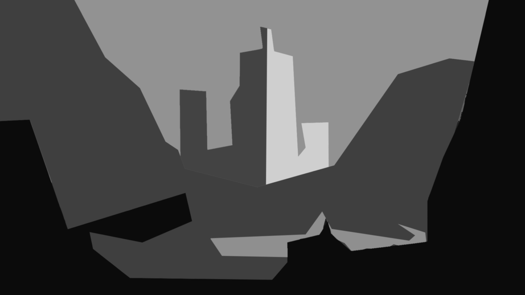
https://www.artstation.com/artwork/nEPovE
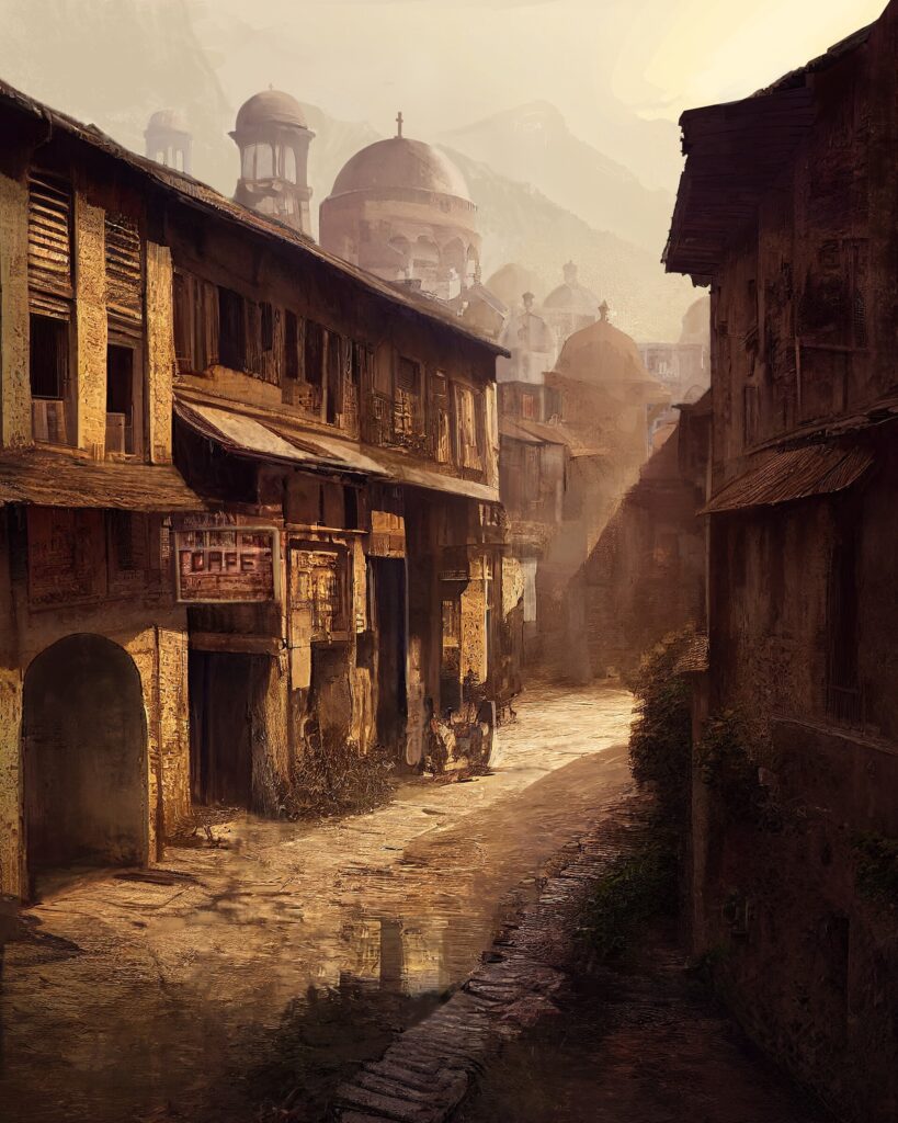
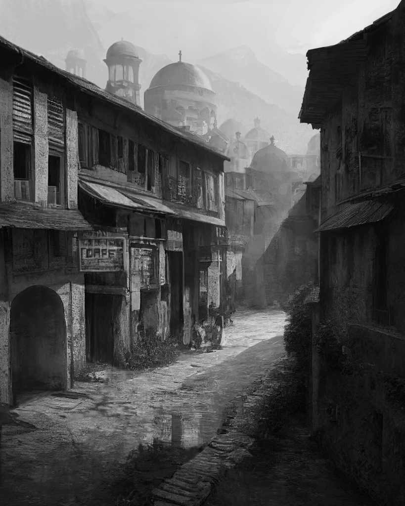
https://www.artstation.com/artwork/2qm0lJ
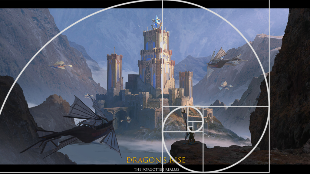
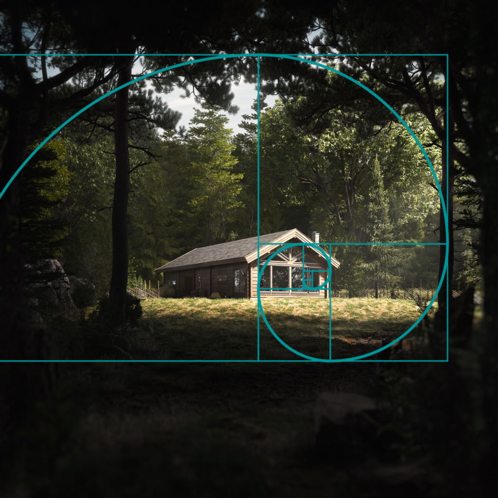
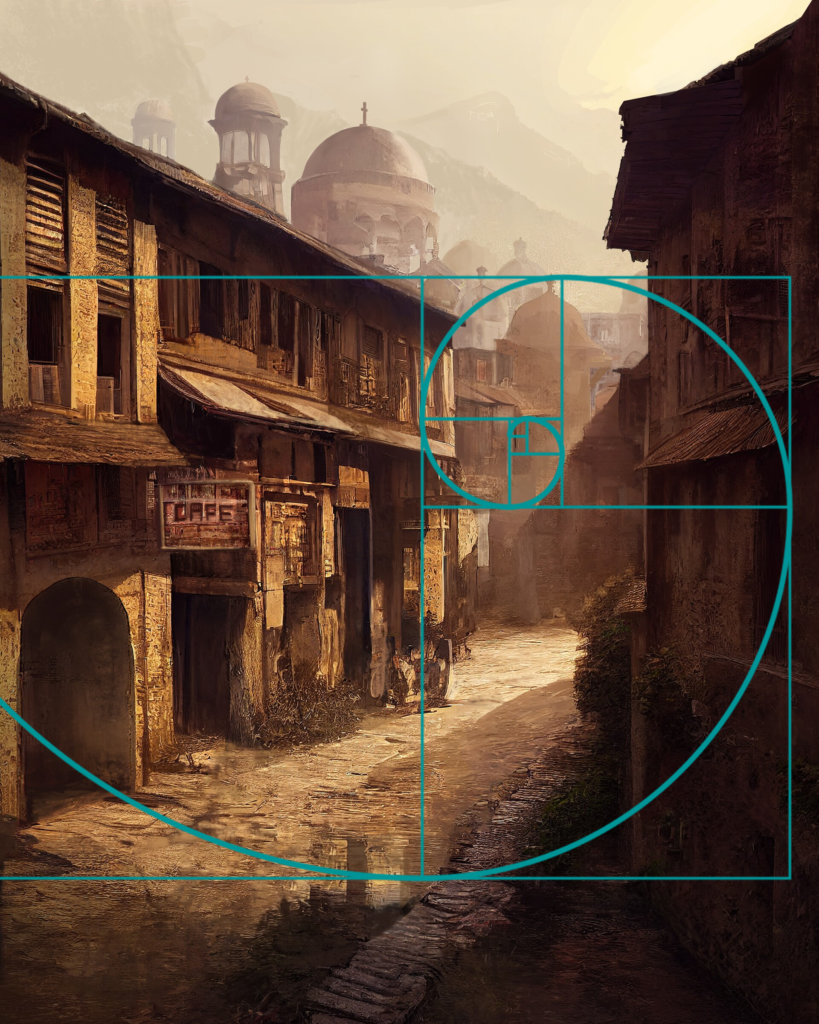
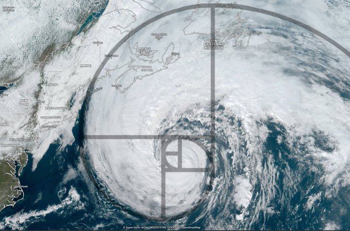
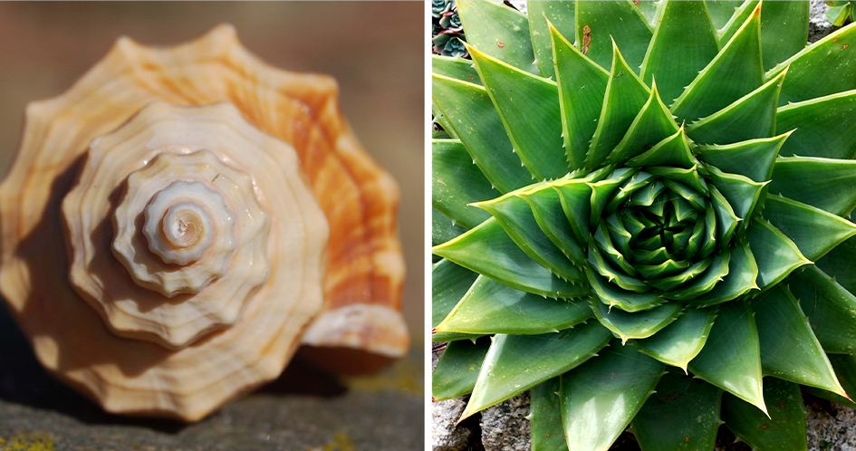
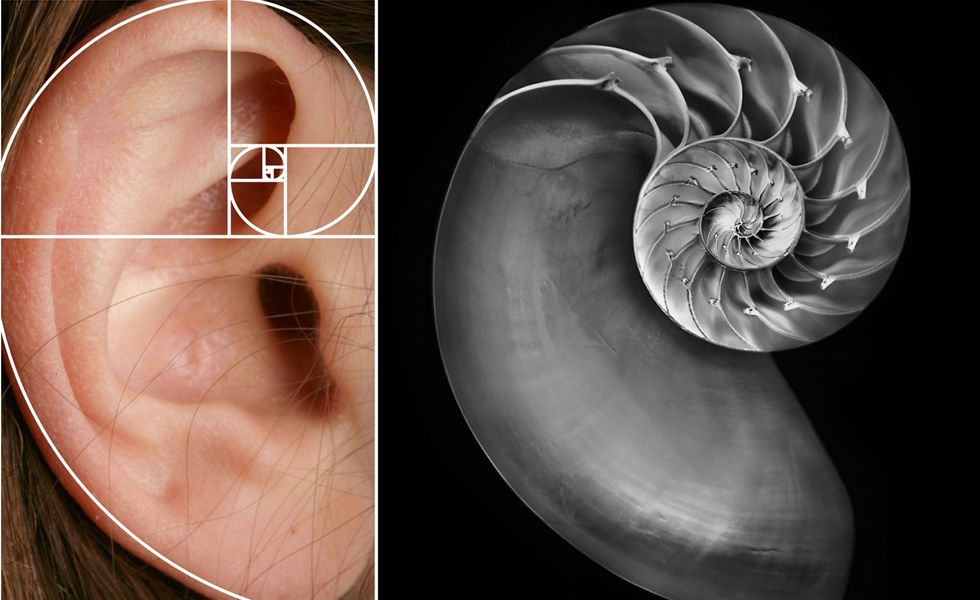
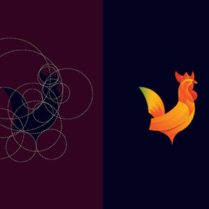
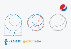
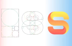
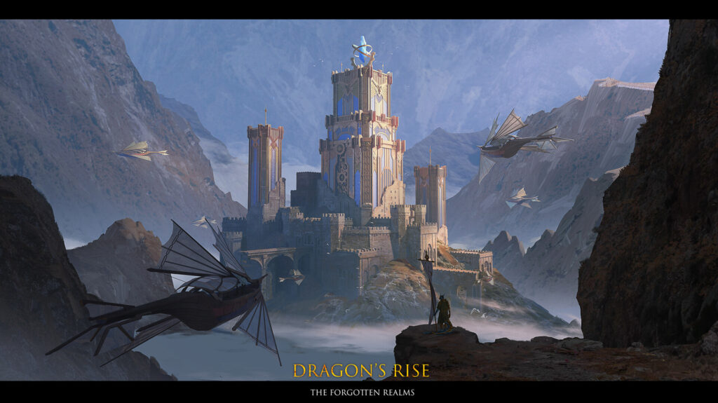
The golden ratio
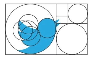
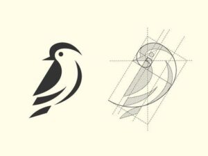
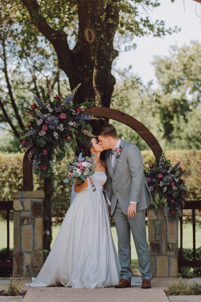
The golden ratio is a composition technique that refers to the idea that this particular mathematical formula is found commonly across nature. When this shape is applied to drawings – laying details to appropriately fit the shape – it becomes more successful. Here you can see how well it fits into the examples shown.
